Introduction | Building a Landing Page That Works
I know, I know. This article sounds like a clickbait article or YouTube video (it got you though, didn’t it!). Regardless, building an effective landing page feels like an impossible task that is often portrayed as some sort of “secret sauce” that often comes across as Snake Oil (ClickFunnels).
What will actually work? What should your Unique Value proposition (UVP) be? How should it be laid out? In this post, I will give you the information and some tools to help guide you in building your first data-backed landing page, regardless of industry.
The Solution
Let me introduce you to the MECLABs formula. I was first introduced to this formula while watching Momoko Price’s CXL course on writing copy that converts (seriously, this course transformed how I view marketing, go watch it!)
The MECLABS Institute has dedicated more than 15 years researching how people choose which products to buy. The conclusion they have come to has been coined as the “The MECLABS Conversion Sequence Heuristic”. Additionally, Momoko’s course contains additional data/evidence-backed guidance on everything from copywriting to landing page layout, which will be incorporated in this post as well.

What is this MECLAB’s Formula?
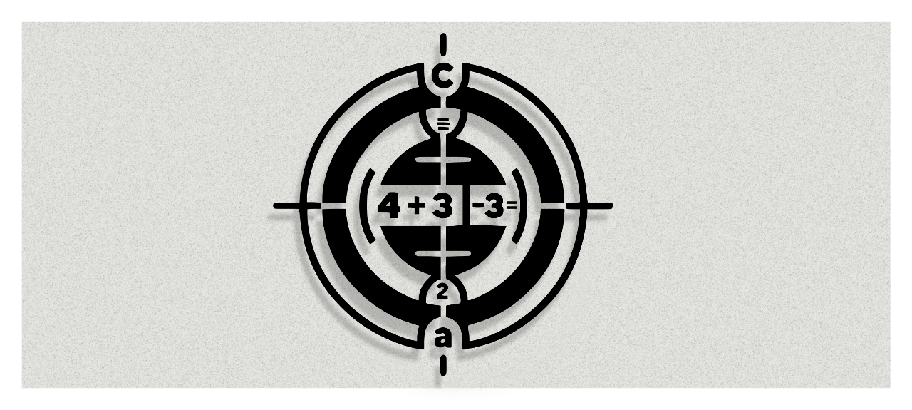
The MECLAB’s formula breaks the journey from visit to conversion into multiple variables. These variables are presented in an equation (see below).

The letters above break down into simple variables. Each variable will be listed in order of importance. The number associated with the variable signifies its importance in the equation in how much it impacts the probability of conversion.
Here is a breakdown of the variables:
C = Conversion: This is the action we want the end user to take. This is often the goal of the page they are on. These actions could include something like submitting a lead form, adding a product to the cart, clicking to call, or purchasing something.
M = Motivation: This is the intrinsic motivation of the user. You cannot control this variable, but you can target it with marketing segmentation. Consider something like emergency plumbing versus someone wanting a bathroom remodel. Someone in an emergency situation is going to be highly motivated versus someone wanting to get an estimate on a future project. These varying levels of motivation are going to influence your marketing segmentation, you may not show ads for a Plumber in the same arena for a bathroom remodel and an emergency call.
V = Unique Value Proposition: This answers the question of “why should I buy from you instead of anyone else”? This is what sets you apart, makes you unique, and what ultimately delivers the end benefit of your product/service.
I = Incentive: This is a positive element in the process. Think of things like a free consultation, free shipping, bundle deals, etc.
F = Friction: This relates to the fatigue, frustration, or aggravation related to the process of taking the ideal conversion action. Think of a laggy website, clunky forms, long questionnaires, bad design.
A = Anxiety: This is the fear we all have regarding if you can actually deliver on your promises. Are you reliable, trustworthy, or is there a guarantee, will it get lost in shipping, will this actually do or provide what it says it will, have others tried this before, and so on. Typically, anxiety comes right before you make a decision. What we want to do is proactively address that anxiety to minimize it versus pretending it doesn't exist.
Now that you understand the formula and the variables, you may be asking what you can do to improve or alter your existing website heuristic. In the below section I will walk you through a variety of ways you can improve your website in order to increase the probability of conversion on your existing or future landing page.
1. Improving Your Unique Value Proposition
The clarity and impact of what sets you apart is absolutely crucial to having users understand why they should pick you to even as basic as what you sell/serve on a fundamental level.
There are a variety of ways to build a Unique Value Proposition and a few optimum ways of displaying this on your website. Being able to inform what your UVP is has been demonstrated to be the most influential variable you can control.
Your Unique Value Proposition is the most impactful variable you can influence.

Determining What Your Unique Value Propositions Are:
There are three ways to breakdown a Unique Value Proposition. They contain the following:
- What your product is/does.
- What’s really unique about it.
- What your customers actually want.
The first two are on you to create, but the last one can be arrived at by utilizing a technique that has been coined as Message Mining. Once you have all three of these questions answered, you can combine them to create a Unique Value Proposition.
What is Message Mining?:
At Optimal we use a concept called message mining to create marketing and sales copy. Instead of copywriting as a creative process it becomes one anchored in data, straight from customers who are best suited to communicate in a way that will resonate with others.
This is the practice of utilizing the voice of the customer to craft copy that reflects their perception of the value your product/service offers. At the end of the day, you want what your product does and what is unique about your product to be explain how to gets what your customers want.
The customers utilized for this include your customers as well as your competitors. This process allows us to craft copy for you that ensures we touch on the value that your competitors customers are communicating.

Suggested Format For Communicating Your Unique Value Proposition
When it comes to displaying your UVP on your landing page or conversion focused pages, you want to keep it clear, simple, and straightforward. And since in the MECLAB’s formula, it is the most impactful variable you can control, it should be the first thing your end user is exposed to on a landing page.
In the below example, you can see that the three Unique Value Propositions listed are connected to a short description. This description was backed by hundreds of reviews, testimonials, and feedback from our customers and our top competitors. We were able to leverage these pain points, anxieties, and wants and connect how we resolve those issues and achieve what our ideal prospect is looking for. We drink our own Koolaid!

Suggested Layout for Above Example
- Specific explanation of what you do/offer, for whom, and why it is useful.
- 3 One-line bullet points that list key benefits or features.
- A visual (background image or side image) to reinforce the industry, service, and message.
- One main call to action
The reasoning for this layout may seem obvious, but it is multifaceted and backed by some psychological principles.
- Hick’s Law: The time it takes to make a decision (in this case, convert) increases with the number and complexity of choices. We want to make it short and simple without cutting the most important things out.
- Fitt’s Law: Make your CTA visible in the Hero/Header section and ensure that it stands out visually with color and size.
- Serial Position Effect: Users tend to remember the first and last sections they are exposed to in a series. So in this case, the hero/header section of your landing page will be remembered/recalled more frequently.
- The Two Second Test: This seems kind of silly, but is a good basic test. This somewhat crude test consists of is flashing the website for two seconds to some co-workers or other individuals with the goal of having them being able to at least guess what industry you are in or what you are selling. If you think through it, this test is trying to uncover how clear and simple your copy is. The lower the mental load on cognitively understanding what you do the better.
We have utilized this very practice on our own website. Feel free to review different pages on our site to see if you can identify what heuristics we have employed.
Introducing an Incentive for Users to Take Action
At Optimal, our mission is to drive tangible growth for great companies. We believe this is unachievable without the precision of closed-loop reporting. It's a foundational element of our process, setting us apart in our approach to digital marketing.
We have all seen it, the free bonus you get with signing up early or purchasing today only. Incentives take all kinds of forms from promotions, events, business consultations, giveaways, and so on. These incentives help get over the hump of making a decision. You may think that these incentives apply to selling products via e-commerce, but in actuality, these seem to be just as effective in the B2B or B2C space. Here are some examples of how you could incorporate this.
E-commerce (Example):
- Free shipping over a certain amount
- Bundling of products that go together with a discount
- Free bonus product with purchase
- Discount in an abandoned cart email
Business-to-Consumer (Example):
- Free Estimate
- A specific dollar amount off during certain months
- Throwing in an additional service
Business-to-Business (Example):
- Free Consultation where the other business gets a sense of direction beyond just working with you
- Free Gift cards (a lot of SaaS companies are throwing out $100 Amazon Gift cards if they get a chance to talk to you)
- Free Trial for certain period
- Some even do a free forever with limited functionality
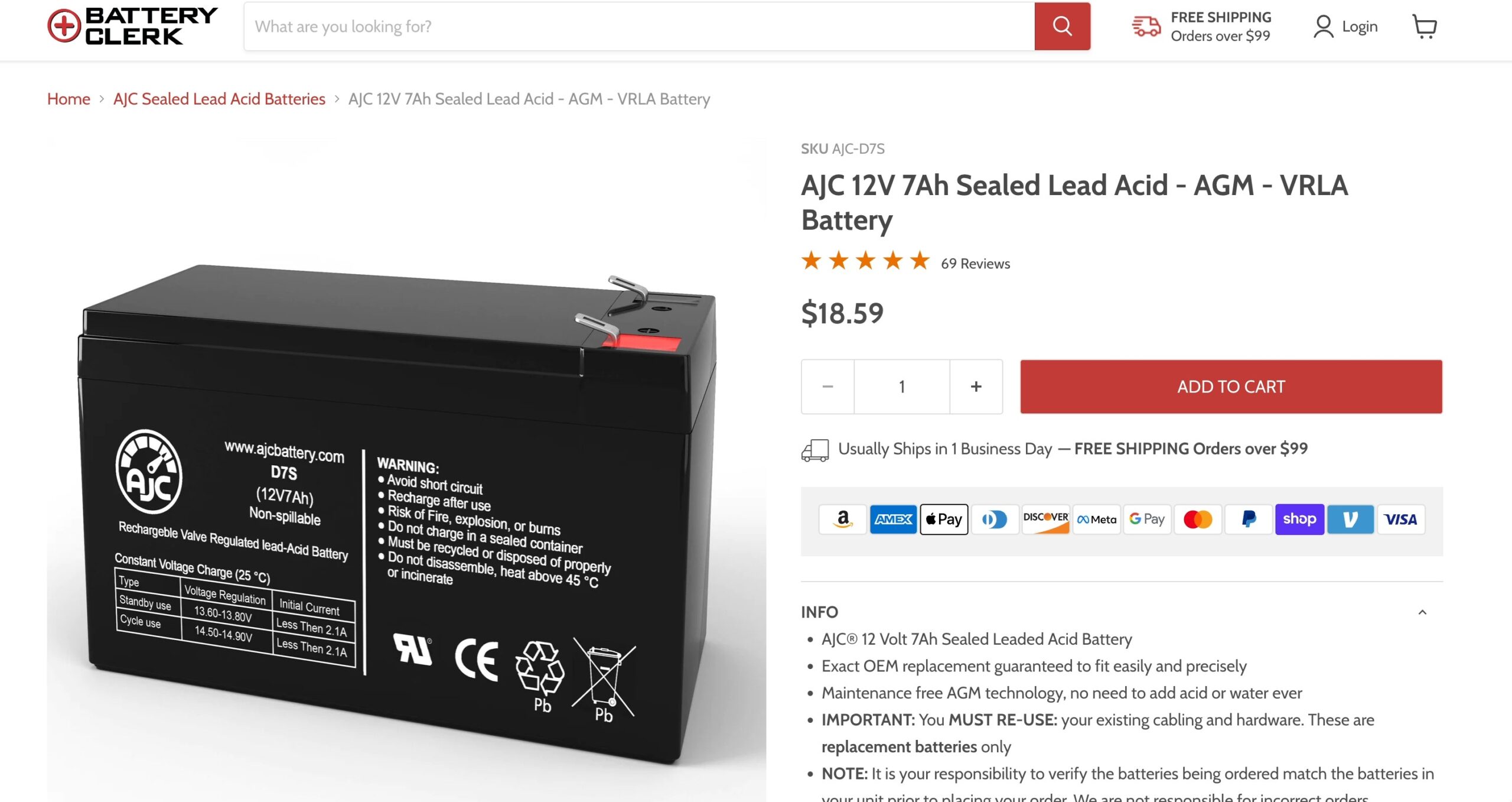
All of these various tactics would be considered incentives. They can be placed on a product page, a pop-up, near the call to action, inside the call to action, and so on. They sort of sweeten the deal for the end user. They feel like, if they convert, that they are somehow getting something out of it.
Clearly, this has to be done reasonably with a cost-benefit trade off; you can’t be giving out $1,000 gift cards in most cases. At the end of the day, you are most likely creative enough to come up with your own incentive that “sweetens the deal” for your target audience; all with the goal of getting more of those desirable conversions.
They sort of sweeten the deal for the end user. They feel like, if they convert, that they are somehow getting something out of it.
Reducing Friction by Reducing Frustration
There are two main types of friction your end user could experience.
Difficulty Related Friction: Using a site that does not work properly, is too slow, or interacts in an unfamiliar way are all forms of friction. These instances of friction are all micro-frustrations for the end user. The more there are, the more likely they are to just bounce off of your website. The less there are, the more likely they are to actually convert. Here are a few examples of friction.
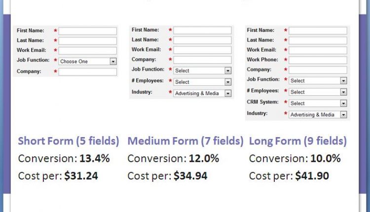
Length Related Friction: The other form of friction is length. Does your end user have to fill out a large checkout sequence? Does your end user have to wait on hold? Does your end user have to fill out a form with 15 fields? These are task related forms of friction. The sad reality is that we live in a “fast-food” culture. Users want things to be easier for them, not harder.
- Hard to read copy due to low contrast
- Unclear directions
- Form that is hard to fill out or too lengthy
- Laggy or slow load time
- Side-scrolling website instead of horizontal (seriously though, no one expects this!)
Now, at the end of the day your end user will have some amount of friction. They do in fact have to do something in order for them to buy from you. That is where the incentives come in. The above incentives can offset the friction you cannot eliminate.
Answering The User’s Anxieties
Have you even been on a site to buy something, but the site looks like it was built in the early 2000s? Yeah, these sites make us feel like something isn’t right, even if that site is actually trustworthy. Or what about a product with zero-reviews that is quite costly? These are all types of anxieties that might pop into the heads of potential customers.
Here are some common anxieties that effect a wide-variety of industries:
- Will you be able to deliver on your promises?
- Can I get a refund if I don’t like it?
- Is there a guarantee?
- Is there a warranty?
- Are my payment details secure?
- Are you established?
- What are others saying about this product/service?
- Do they have proof of quality work?
- Whom will I be talking with?
All of these anxieties can pop-into the mind of a ideal prospect at different points in the sales cycle; but that is beyond the scope of this post. But, each of these anxieties can be addressed in different ways. Here are three ways you can address these anxeities.
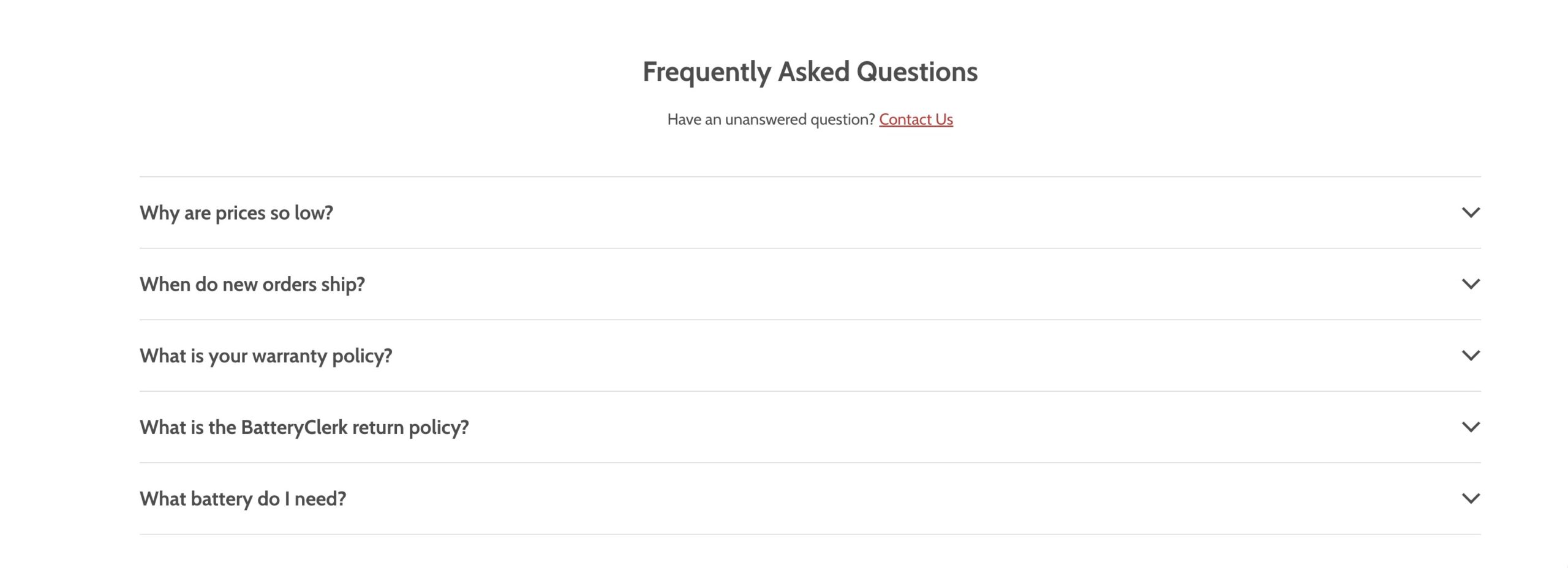
Having a FAQ on Key Pages: Immediate Answers to Common Queries
Incorporating a toggled FAQ (Frequently Asked Questions) section on important pages can address common questions and concerns early.
A toggled FAQ section readily provides answers to common questions that users might have. This immediate accessibility of information prevents users from having to search extensively or contact customer support for answers, thereby saving time and reducing frustration.
Having Testimonials Near Areas You Need to Bolster Trust
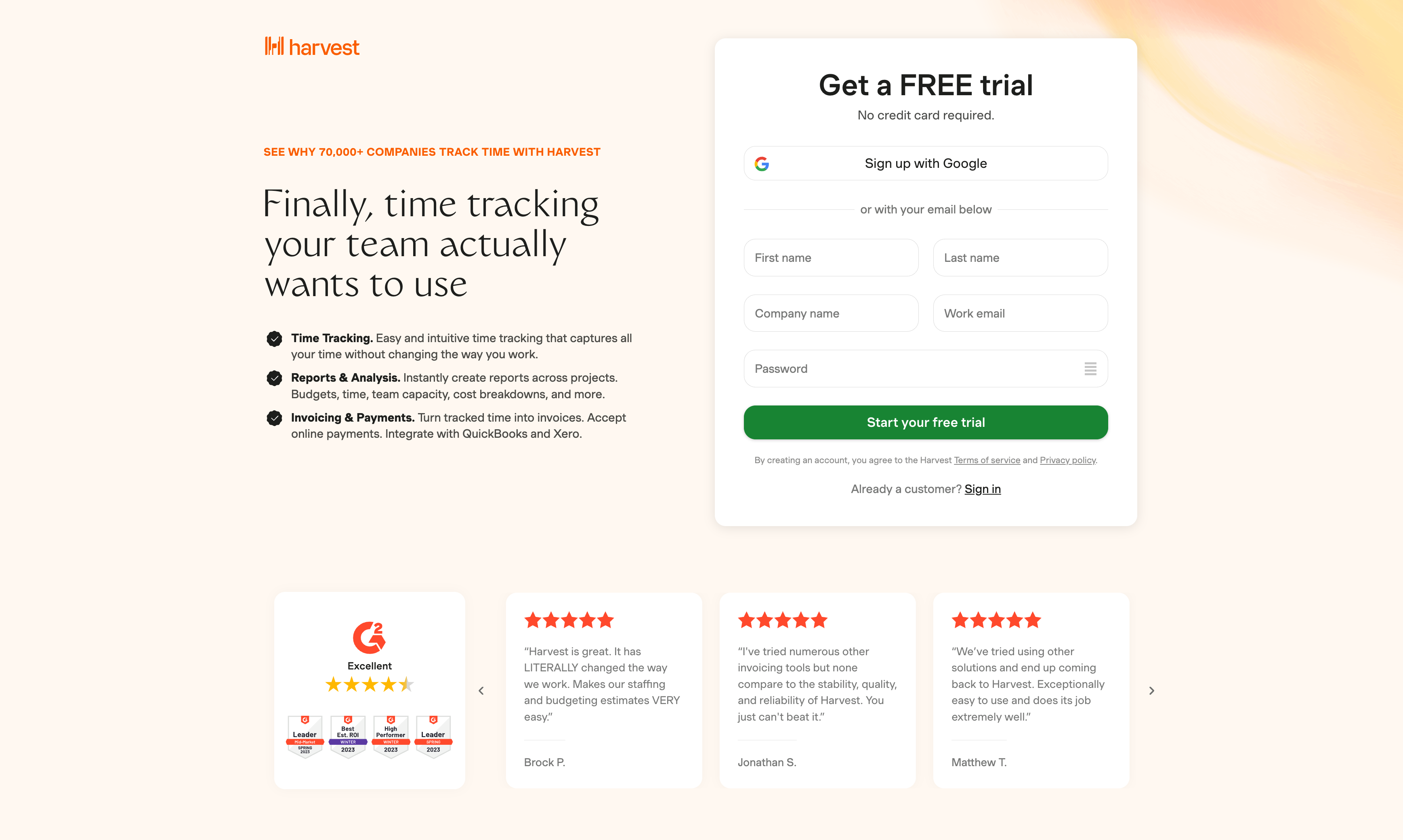
Placing testimonials or trust symbols near areas that need it can help corroborate your claim to fame. Users do not always want to take your word for it, they want to see some sort of evidence to back your call to action or feature. We suggest strategically requesting testimonials that address common anxieties. By doing this, you can address these concerns using the customer's voice, which builds a higher level of trust compared to your own voice. This approach is more effective than simply asking for testimonials; it involves placing them strategically alongside the points where the anxieties arise.
Here is an example from Harvest, they placed a slider from a well known SaaS a peer-to-peer review site.
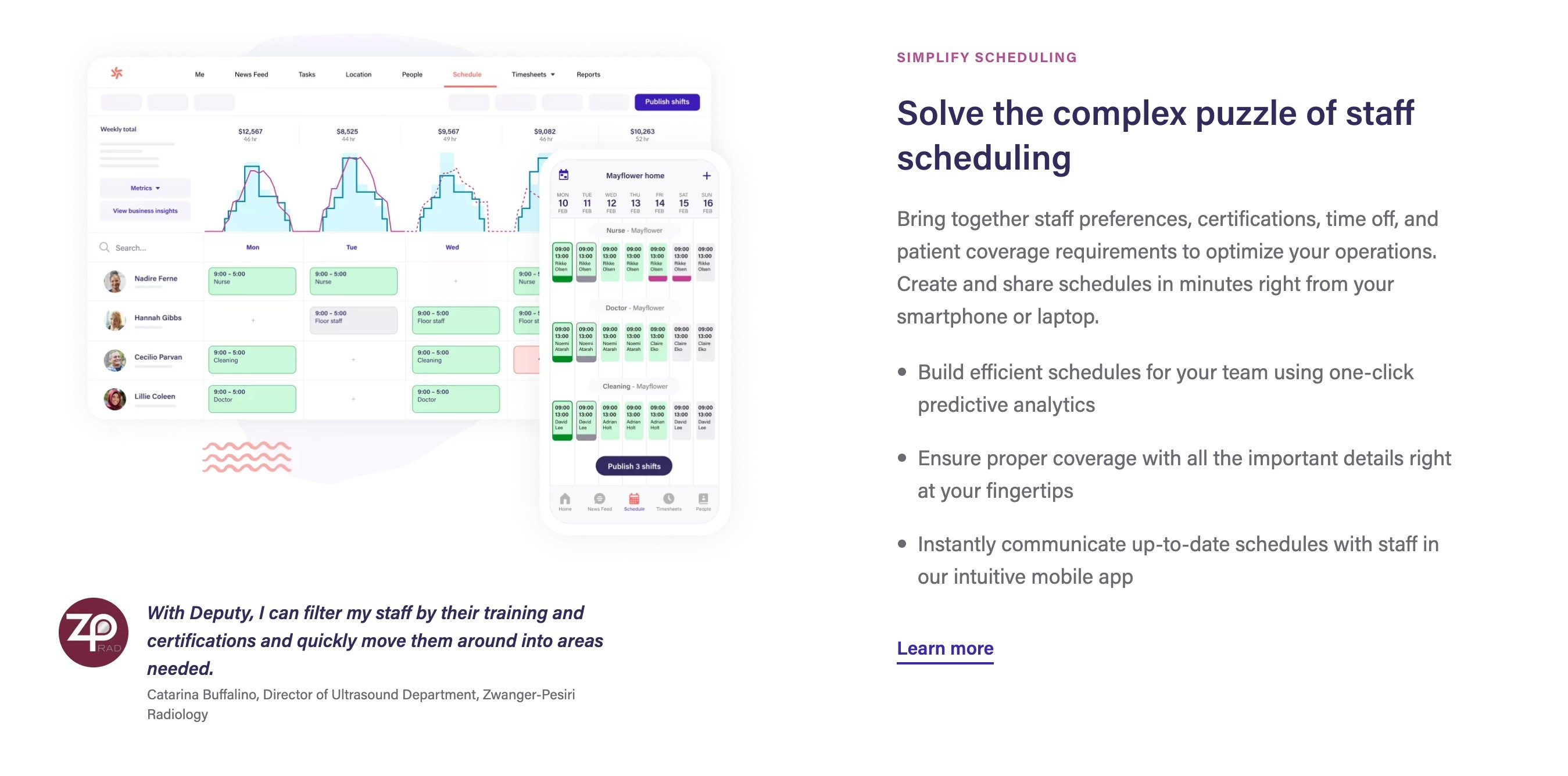
Here is an example from Deputy, in which they corroborate their claim of each feature/benefit with a topic relevant testimonial. This helps ideal prospects trust that they are actually going to fulfill on their promises.
Trust Symbols, Reviews, and Statistics
Yes, we still need to see those trust symbols, reviews, and # of customers. You might be able to get away with not using these if your company is very well established. But even then, someone like HubSpot cannot get away with not doing this. At the end of the day, we are social creatures, and if we see numbers that make us feel more safe with brands that we are familiar with, we will end up lowering our level of concern with a specific product/service.

Conclusion
This article was meant to be an introduction on how you can get started on building a landing page that converts. This is by no means a comprehensive guide that will walk you through every single step (heck, we never even got to talking about A|B Testing!). Instead, my hope is that this article gives you enough of a jumpstart with clear direction. By intentionally addressing each of these variables on your next landing page you will increase the probability that users will convert on your site.
If you are looking for a wholistic approach and wanting to take this to the next level, you can always book an intro call with us to discuss the possibility of working together. Click the link below to get started, if not, you can find me LinkedIn and I would be happy to hand out 5m of free advice.
 Ryan Warner